Monday 13 September 2010

Week 2 - more drawing!

Today was about combining some of the techniques we'd tried last week. First we had to pick three objects - I chose a brown glass bottle, a scallop shell and a pine cone. Then we had to find techniques suitable for each object, matching it's texture etc.
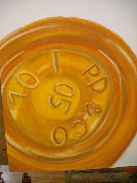
Bottle base, using soft pastels
 Ok, so I stayed well within my comfort zone here. I love using pastels and charcoal, and it's just so fantastic for the smooth and reflective surface of the bottle. Lifting out creates those highlights so well, and it's very messy!

The big picture!
The paper I'm using is A1 - apart from using the 6 foot long stuff in church, for painting during worship, this is the largest paper I've ever used. The bottle base is on the left, and the brown paper on the right is in preparation for the shell, which I decided to do using stippling.

Shell close up
As you can see I didn't just use stippling. After looking more closely at the shell, I noticed it was more linear than I'd first thought, so I used a Sharpie marker to create the lines. I added the stippling to create some depth. To me it all feel a bit scribbly and I'm not sure how well it sits with the very soft and smudgy bottle  base.
Bottle and shell together
Here you can see the bottle and the shell together. I think they both work well on their own but I'm not sure about the two combined. I didn't have time to do anything else, but I'm about to start drawing some pine cones. I am going to use graphite and coloured pencils, then use our colour copier to reproduce the cone detail. I will then collage in between the two other elements. I will need to do some accurate cutting, but I want an almost photographic quality and I think the photocopied look will help with that. So time to stop typing and start drawing!

No comments:

Post a Comment