Monday 22 November 2010

First Life Drawing Class

Here are my first attempts at life drawing.

The head is too small but otherwise I'm quite pleased with this.

Different view but I think the proportions are mostly ok.

I'm especially pleased with the hands and feet of this one.

I need to learn how to do better hair, but I'm pleased with the proportions.
 All of these were down with pencil or graphite stick. Then I had a go with charcoal, which I think was much more successful.

This looks much freer and the shading is better.


The same image but in reverse on the photocopier.


Detail from my charcoal, photocopied and then worked over with oil pastel, and ink.


Details from the charcoal photocopied and worked over in pencil and oil pastel.
This was easier than I thought and I was quite disappointed to have to miss the following session due to a rather pointless hospital appointment!

Saturday 6 November 2010

New Project

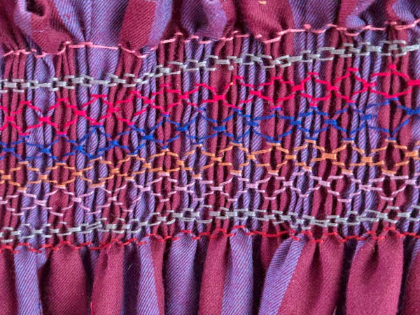
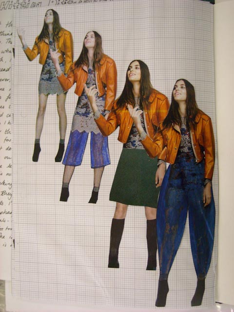
The bookwork project is now handed in - and of course I forgot to take photos of the final bookwork! Oh well, on to the next thing! Our new project is entitled 'Sight, Sound, Movement and the Body', so just a small area to work on then! I've already started thinking about it and have filled the first two pages of my new A3 sketchbook with mind maps and notes, and I've just been printing off some of my favourite portraits etc to go in the book. At first I was very tempted to just shoot off down one line of enquiry, thinking about train journeys, but after thinking about it some more I've decided to keep this one as open as I possibly can. I'm going to try and relate it as much as I can to personal experiences, because I think that will help to keep it large!
We're starting with some life drawing on Monday, which I am really looking forward to. Then we have a visit to the V and A on Tuesday, and next Tuesday we start some workshops with the media tutpr on film, and photography and other technical stuff.
I've already had a bit of a go with my camera which is a little Nikon cool pix, and with the Canon digital SLR which belongs to the household, but I don't consider as mine, because to be honest it scares me a bit. I haven't really got a clue how it works so I tend to use the Nikon if I can. I've done a bus journey - taking photos at each bus stops - from the bus not getting off, as I was on my way to the hairdressers! I've taken some time lapse pics of me preparing dinner - very exciting, and today took some pictures at the football.
So lots of ideas and trying to keep things as open as possible - with the last project things got very decided upon quite early on. I'm determined to keep this one as open as I can for as long as I can!
I was about to post an image but blogger is not co-operating - as it is I'm typing this in Times New Roman despite having selected Arial - we'll see what it posts it in! So no picture this time but I'll post on Monday!

Thursday 21 October 2010

Nearly there!

No college this week due to the college equivalent of an INSET day - it's nice to be getting the day off instead of having to go! So I've done some work at home. The bookwork project is nearly complete now. I've made the final version of the gift bag, and decorated it with pencil drawings of flowers - very loose and sketchy. I didn't use the bright pink embossed word purity, that I'd been saving as it just didn't seem to fit. That'll go in the sketch book though because I still think it's beautiful! I've finished the wardrobe to go in the bag - I added some fashion guidelines on the back. I still have some work to do on my eyeshadow pop up. It needs more people and it needs something written on the front but what I'm not quite sure!
I've also been doing some research for our Cultural and Supporting Studies lessons. I picked Aubrey Beardsley, who I'd never heard of, and I have to say his drawings are amazing, but not for the faint hearted or easily shocked. Having taught small boys for a large number of years there is a real element of the naughty little boy running around shouting 'belly button' about some of his work - look how shocking I can be! But his technical ability is amazing and you can see it's influences up into the 1970's, including the Rod Stewart song You're in my Heart!
No photos this week, but I will post some of the completed bookwork when it's done. As a first project it's been an interesting one. I think I want to do more drawing because I do love it so much, but I also rediscovered  my love of printing, especially direct trace, and perhaps I can exploit that technique a bit more. I hadn't realised how mych I love working with image and text together. I felt my work really come together when we were allowed to use text too. I think I've learnt as much, if not more about myself on this project, as I have about visual communication!

Friday 15 October 2010

The final hurdles.

This week at college was all about finishing off and how to mount our work. I was dreading this because we had an A1 board and needed to window mount pieces of work on it. This involved use of a craft knife - always a scary thought! I know that neatness is not my best asset, I find it really hard to get things precise, and trying to cut carefully was something I was not looking forward too!
But before I did any cutting I tried out lots of layouts - spot the difference!


I decided I liked the portrait layouts better, so my final layout choice was this.
All the images are surface mounted except the wardrobe (top left) and the embossing (bottom right).  I think the board reflects the theme of the project and the range of techniques that I have used.

As well as finishing the board, I have also finished my mini-magazine for my gift bag. Here are the pages, and front and back covers.

Front cover with white lettering

Introduction typed on the PC


I used Publisher to make the magazine. I did consider using InDesign but as I've never used it before I decided that I would stick with what I know, until I've got time to work out how to use a new program. All that's needed now is the final version of the gift bag and then a last sticking in session with the sketchbook. I'm just desperate now to know what the next project is going to be.

Paper making results

On a previous post I talked about paper making, and we were able to collect the results this week. I made 4 pieces of paper - it seemed like more at the time! I'm pleased with the results but I'm not quite sure how they will fit in to my current project. I think they would have worked well with the Amish stuff but not so good with the more modern approach that I've taken. Still, here are my four pieces of paper.
The paper on the left is pink on the other side and has threads embedded into it.

Again I used threads and added buttons which I took off when the paper was dry.

Sunday 10 October 2010

Catch up!

This post is really just to catch up with where the current fashion project has got to, before I go back to college tomorrow and do a load more stuff on it! So here are some photos to show where things are. It's coming towards the end of the project now really, so I'm beginning to think about my final 'bookwork'. This can be anything that combines text and images, along my chosen them, and can include but doesn't have to, work that I've done already. Last Tuesday we did some work on paper folding - origami and pop ups. I LOVE pop-ups (I know capitals means I'm shouting but that's how much I love pop ups!) So here is an idea I had for using a pop up in my final piece.


Cat walk pop up with the caption 'Life is a catwalk... who is your designer?

 I've already started my final version, which I decided to make an as eye shadow compact, using chalk pastels and acetate on the top. So here it is.


 So what is my book work going to be? Pretty much all along I've been thinking of making a wardrobe and having things hanging in it with images and writing on, but as my project has changed direction this needed a rethink. My target audience suddenly came into consideration - I'm aiming this work at young women, 15 - 25, new Christians and those who have been Christians a while. So what do they want? After doing the origami I started thinking gift bags - ladies of all ages love getting a freebie gift bag with stuff in it. There's something about it which makes you feel special and valued. So I decided to make a gift bag.

My first attempt at a gift bag, and a photo of the gift bag given out at the last CCK(Church of Christ the King in Brighton) women's day. I embellished mine, but loved getting it!
The next decision - what to put in the bag? I'd already got the eyeshadow pop up idea, and my tutor suggested a mini-magazine using some of my images. I'd seen some little scrolls in Cloth, Paper Scissors magazine that looked great so I decided to use some quotes from one of my favourite books, Captivating by John and Staci Eldredge. I tried hand written quotes but they didn't look right so I photocopied the pages, painted white acrylic over the bits I didn't want to highlight, painted the pieces of paper pink, then added extra drawings and scribbles in red and silver. I then assembled the whole thing to be like a lipstick. The one you see here is the prototype - the proper one is much prettier, with a burgundy and gold case. I'll try and post some pictures of that with the entire finished article!
Waiting for the pink paint to dry on my chosen quotes

The handwritten scroll - just not quite what I wanted.


Prototype lipstick case

It's in the bag!


Onto my mini- magazine, the first thought was the cover. I looked at some magazines and came up with 4 ideas.
Based on the idea of negative letters - my favourite

Based on Glamour magazine

Using another piece of work with cut out letters

Based on a magazine called oh comely, which had a very handwritten cover.
I've chosen the first cover as the one to use, although I might need to adjust the image a little, and I'm going to use a white background, not pink!
So we're in the home stretch with this project, and I'm so thankful that Adrian has been giving me ideas and helped me get back on the right track. I'm also grateful to Fran (my lovely daughter in law who is very much part of my target audience) for having a look over the project and giving her opinion. The next part is choosing images to mount on the A1 board, and cutting accurate mounts for them - not a strong point for me!


Thursday 7 October 2010

Paper making

No pictures for this week, due to the fact that I got so involved with the paper making, and it's very messy with lots of water! We were back in the print room this week, for a go at making paper, which is something I've never done before and will definitely consider doing again. We needed to work in pairs which is great because it makes you talk and interact more with your classmates, and I'm really loving finding out what everyone else is doing for their projects. The paper is now drying out in the print room, so I'll try and post some pictures next week.

Thursday 30 September 2010

Monday in the Print Room

I was looking forward to going in the print room, as I'd done some printing at my evening classes. They didn't let us loose on the big presses (yet!) but we used lots of old wood block letters, which are so beautiful to use, really chunky and tactile. The lovely noise the ink makes as you roller it is good too!

This was my first image. I love the E stamp!

I used blue ink with the same letters over this advert from Glamour magazine. I love the freshness of this image.
Using letters to cover up this model worked well.
I also used the same letters to create some people, but I'm going to do some more work on those and will post that later!

I used a page from 'Captivating' one of my all time favourite books, which is all about womanly beauty and the Christian life as the background for this. I love the little letters which our tutor got in Early Learning!
The next three images are about the labels our clothes give us. We wear designer labels, or fairtrade cotton or our favourite shop, but what we wear also influences what people think about us. I know in our post-modern world that that is not a popular thing to say, but it's true otherwise why would people buy fashion magazines and have face lifts? So if you are dressed immodestly what does it say about you? The bible verses often quoted about women's hair etc were written by Paul to the Corithians who were living in a city with temples to Greek gods, were temple prostitutes were used. Paul gave his instructions so the Christian Corithians could distinguish themselves from the temple prostitutes who had short hair (women) and long hair (men) and dressed in particular ways. So Paul was saying don't dress like a prostitute or you could be mistaken for one. That seems sensible advice and still applicable. So what labels do we wear? Cheap, easy, frumpy even?
This came out gorier than I wanted because of the red ink!

Taken after I'd done the image above. Again a bit gory!

Much better! I think the blue has more impact, and I like the way the writing obscures her face.
 

There are a load more things to post but I haven't taken pictures of them all yet. There are so many ideas now and I feel the project is finally beginning to say what I want it to say. I want to do some text experiements and some fashion drawings of my own now!

Change of Direction

First of three posts to try and catch up with where I'm at with the project! As my last post showed I was really struggling with my theme and where I was headed. After bending Adrian's ear about it for most of Saturday, and then feeling inspired by Brighton's win at home (Had to put that in because I'm just not used to it yet!) I worked until 10pm on the following ideas. Instead of looking at Amish fashion, which is not really what I believe is necessary to be modest, how about altering images from fashion magazines to make them more modest? So I bought a copy of Glamour and then found some images to work on. Perhaps it's because it's Autumn but there was less to work on than I expected! I used some of the techniques from last week - tracing paper, drawing on top of an image, and using acetate.

This is the first experiement. I used pen to give the girl on the right a longer skirt. The girl on the left is what I would consider to be modestly dressed anyway!
So after the initial experiement I got busy with the photocopier (thank goodness we've got a multi function printer here at home!) and produced the following images. I decided to stick them on squared paper as I wanted a designed look to them.

Advert for Topshop with 2 alternative suggestions

 This was a good image as there were lots of possibilities, despite the odd pose of the model

She looks a bit dumpy but I think the idea works ok.

 I had to work hard on this one, and the stripes were needed to disguise the belly button!

Another good image as it allowed for lots of possibilities.
Finally I feel like the project is heading where I want it to. It's relevant, fashionable and saying something. I couldn't wait for Monday to start working with text and trying out some stuff in the print room!