Wednesday, 2 March 2011

The Big Collage part 2


Having just reminded myself of where I'd got to in the last post, I'm going to explain the next steps I took in creating one of the biggest pieces of art work I've yet attempted. As a side note on that, the canvas I worked on was a present from Matt and Fran and it had been sitting in my cupboard, intimidating me forover a year. It looked HUGE! However, after being on the Foundation course for nearly three terms, and getting used to working on A1 (shock, horror!) size paper, the canvas almost (almost!) seemed to small! Anyway, here's the next step.
I had to work from the back forwards for the next part. These flowers are photographs taken by me and Adrian at different times. I didn't worry about scale, but did try to get a balance of colours. The shape was also important.

To make the tree trunk look textured I started with corregated card, but I didn't want straight lines. I used gardening string to create the bark including a knot hole!

Next step was to add the photographs that I wanted appearing from with the foliage. I also added another secret message, which I will not reveal even now.

I sketched out the extent of the leaves using white pastel as it could easily be removed from the painted surface.

The trunk of the tree was painted with acrylic paint.

I then started to add the leaves, which are made from screwed up tissue paper in two shades of green.

The finished leaf canopy. I left the gaps to make it seem a little more realistic and less like a lollipop.

The flower beds seemed odd. There was no demarcation between them and the lawn, so I decided to add some stones.

Keen to use what ever was to hand I used a cereal packet to create stones in a range of different sizes.

I then painted to stones with acrylic paint. I tried not to mix the colours too much, so I could get a stone effect.

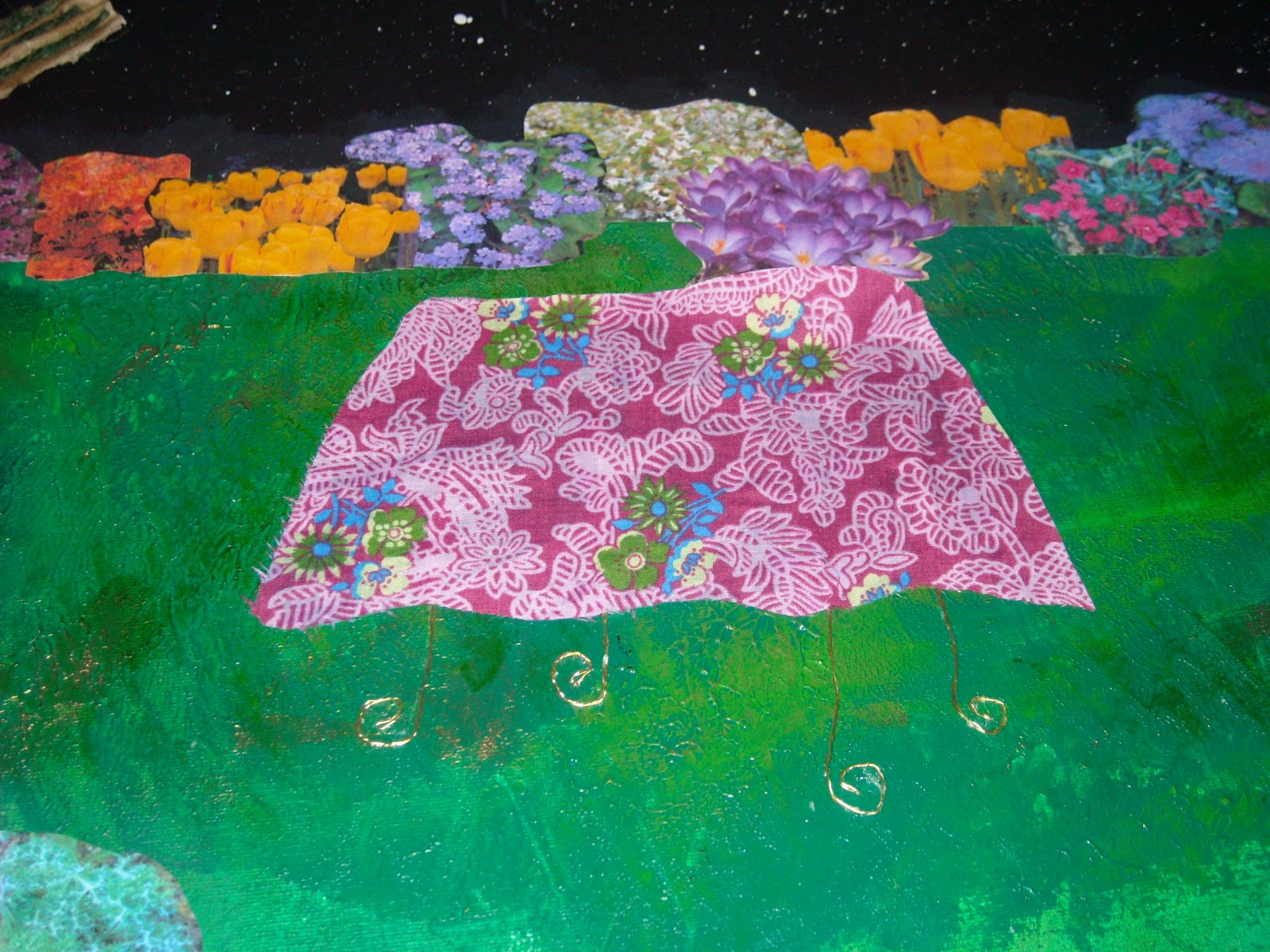
The picnic table was created using fabric and wire that came from a wine bottle. I twisted three strands of the very thin wire and then made the legs. I tried to get a sense of perspective but realised I should have made the table top more rounded.

The table was positioned on the lawn.

The tree trunk looked too unifrom in colour so I used oil pastels over the paint. This helped create a real depth to the trunk.

My favourite of the ten abstract collages I had done at the beginning of this project included lots of little pockets. I wanted to use the same here, but it just looked like someone had dropped a load of litter in the garden. Time to think again.

I decided to use stones around the tree trunk.

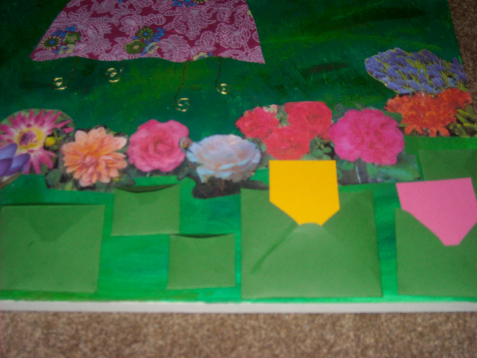
I also decided that instead of packets I would make some evnvelopes. I found a net on the web and made green envelopes in 3 different sizes.

Although the envelopes originally had flaps I cut those off as they seemd to be intrusive. I wrote little nots to put in the envelopes which included the date of my marriage, the first paragraph from The Wind in the Willows, Bible verses and some thoughts of my own.

This is the nearly finished piece! It is awaiting photos of a teapot and our favourite cups to go on the table.
 I was so pleased with this collage. It is colourful, romantic, whimsical - things I have always longed to have in my art work. I love that there are hidden messages which can never be seen again, other than in photos. I love that there are messages which the viewer is invited to read, and which can be changed. It is a very personal piece and I feel that it has helped me develop greatly as an artist. I would definitely work in this way again.

Friday, 25 February 2011

A big collage part 1


 This collage took several days, and is really the culmination of what I had been exploring in the 2D fine art project to this point. When I had finished it I heaved a sigh of relief but actually there is so much further I could go, even just within this project. However we are on to 3D fine art from next week, so my mind has moved on! However here is part 1 of the big collage!

These first few pictures show writing which I intended to be covered up with paint. I have realised how much I love to have a story to my work, but as my tutor pointed out to me, it doesn't need to be obvious to everyone.

Bible verses are the foundation of my life so they are the foundation of this art work


.

Painting over the verses was easy!
 Inspired by the work of Alan Bean - an Apollo astronaut turned artist who uses his moon bookts and tools to create texture in his paintings, I used pallette knives and my and Adrian's wedding rings in the acrylic paint. I mixed the paint with gel medium to allow it to hold the texture.
Grass created with pallette knife

I hoped this purple would show through where the wedding rings lifted the paint.

I rubbed in other shades of green acrylic and gold paint to highlight the texture.


Wedding rings created the sky texture - they look like planets or moons.

To create stars I used a spattering technique, making sure I masked off the grass.


I wanted to add a moon and a galaxy to my painting but I know I couldn't paint to the same standard as a photograph. However when I put the printed off galaxy on the piece it didn't work because printer black is too different from acrylic paint black. So it was bye-bye galaxy. The moon looked ace though!
My beautiful full moon

My awful galaxies!


Monday, 31 January 2011

More Printing

I really love printing and it's been great so far in this project to really be able to experiment with some new techniques and ideas. In my last post I talked about feeling inspired by space themes, so I've done some more printing on a space theme.
I used a roller to create this Martian landscape, blending 3 inks - yellow, red and cerise

Using the same inks I rollered onto textured paper.

I used the blended plate as a basis for adirect trace. It wasn't great so I rollered over it with black and then added some direct trace labels.
After exploring the Martian colours I decided to explore the earth from space idea and did the following pieces.
Using a blue-green blend I made a mask and created a circle of ink using the roller. I then added white acrylic clouds and a label using direct trace. "Like a blue-green marble floating in space. And life continues on that blue-green marble though I am out here."

I used the mask from the print above to create this print. It was inspired by the story that if there are male and female astronauts on the space station they argue about the heating levels! The direct trace writing says "Strange to think that above our heads an arguement may be raging about the heating."


 These prints were produced at home but we've also been in the print room some more. I had my first attempt at drypoint etching, which I loved. Unfortunately the ink didn't really agree with me and I had an almighty sinus headache the next day! A shame because I think the results are great!


Drypoint etching - a silver teapot. I am so thrilled with this!


Chine colle - applying tissue paper to the etching plate before printing.
After attempting these we moved onto linocuts. Again I loved using this technique and have been pretty thrilled with the results. I love the folky feel to them.
First try - a small coffee cup. I was trying out different lines here.

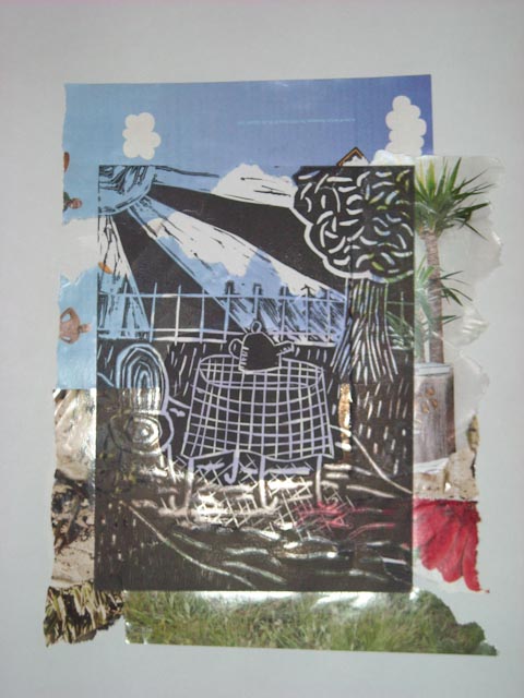
Tea in the garden. I am thrilled with this too, even though the teapot doesn't have a lid! Oops!

The same linocut on gingham paper. It works well.

With a collage base, which I tried to match to the elements of the linocut, with some success.
 I really do love printing. I like the techniques, the waiting to see what the result is. There is a kind of magic to printing, an element of surprise that is so much fun. This is definitely something I want to come back to!

Sunday, 16 January 2011

New Year and a Fresh Start

I didn't do too well at posting during the last project, mostly because I wasn't really enjoying the media element! It was a bit hard going, and although I found things to enjoy, as a whole the project turned out a little disappointing. So, New Year and Fresh Start! This term we are working on 2d and 3d fine art. I was really looking forward to making collages and painting but we are supposed to be working in abstract and I HATE it! I am not an abstract artist! I have tried hard. We had to make 10 collages, with no theme or anything representational. So here are some of mine.
My first collage - silver, white and transparent

My second collage - spots and ribbon

My third collage - trying to work small but failing!
 These are the first three I did, and I just feel they're a bit nothing-y. I could just have easily used a box of what I used to call 'licky-sticky' shapes. I felt like I was doing what I was told when in fact I could have produced something of a much higher quality if I'd worked representationally. I have realised that I already know enough about myself as an artist to know that I like my art work to tell a story, and although I don't need photorealism for that, I do like things to look a little more like something rather than just a collection of stuff stuck on some paper!
OK - rant over! We are also working on printing this term - hooray! Although we were encouraged by the tutor to work in abstract, she also said that she never does so not to worry if we'd rather be representational! So we started with monoprints - direct trace etc, which I LOVE! So here are some of my first prints. I chose a space theme as a couple of my collages looked a little like planets.

Direct Trace - Space theme

Using a pencil and my thumb to create a ghost like image
Direct trace using several colours - I think this has worked well.
In the style of Rauschenberg's Stoned Moon series


Combining colours, pencil and fingers to add pressure and lift the ink.


Wiped away with a cotton bud
A mask for a print

Mars Rover - using the above mask

Martian landscape using wipe away technique

The Rover was too pale so I used the mask!
I am happier with these because they have a theme. I love the immediacy of printing, and it's magic - you never know quite what you will get! After working on these I tried some space themed collages, which were a little abstract but I am still not happy with them. I think I am trying too hard with the abstract that, and it's getting in the way of my style.
Space as a theme is also maybe not quite right. I love space travel, espcially anything to do with the Apollo missions, but I feel like I am wasting some of that enthusiasm on something that is not really working. I want to make the most of the space theme. So I have just been researching teapots!

Monday, 22 November 2010

First Life Drawing Class

Here are my first attempts at life drawing.

The head is too small but otherwise I'm quite pleased with this.

Different view but I think the proportions are mostly ok.

I'm especially pleased with the hands and feet of this one.

I need to learn how to do better hair, but I'm pleased with the proportions.
 All of these were down with pencil or graphite stick. Then I had a go with charcoal, which I think was much more successful.

This looks much freer and the shading is better.


The same image but in reverse on the photocopier.


Detail from my charcoal, photocopied and then worked over with oil pastel, and ink.


Details from the charcoal photocopied and worked over in pencil and oil pastel.
This was easier than I thought and I was quite disappointed to have to miss the following session due to a rather pointless hospital appointment!

Saturday, 6 November 2010

New Project

The bookwork project is now handed in - and of course I forgot to take photos of the final bookwork! Oh well, on to the next thing! Our new project is entitled 'Sight, Sound, Movement and the Body', so just a small area to work on then! I've already started thinking about it and have filled the first two pages of my new A3 sketchbook with mind maps and notes, and I've just been printing off some of my favourite portraits etc to go in the book. At first I was very tempted to just shoot off down one line of enquiry, thinking about train journeys, but after thinking about it some more I've decided to keep this one as open as I possibly can. I'm going to try and relate it as much as I can to personal experiences, because I think that will help to keep it large!
We're starting with some life drawing on Monday, which I am really looking forward to. Then we have a visit to the V and A on Tuesday, and next Tuesday we start some workshops with the media tutpr on film, and photography and other technical stuff.
I've already had a bit of a go with my camera which is a little Nikon cool pix, and with the Canon digital SLR which belongs to the household, but I don't consider as mine, because to be honest it scares me a bit. I haven't really got a clue how it works so I tend to use the Nikon if I can. I've done a bus journey - taking photos at each bus stops - from the bus not getting off, as I was on my way to the hairdressers! I've taken some time lapse pics of me preparing dinner - very exciting, and today took some pictures at the football.
So lots of ideas and trying to keep things as open as possible - with the last project things got very decided upon quite early on. I'm determined to keep this one as open as I can for as long as I can!
I was about to post an image but blogger is not co-operating - as it is I'm typing this in Times New Roman despite having selected Arial - we'll see what it posts it in! So no picture this time but I'll post on Monday!